Overview
A UI/UX design case study completed as a technical assessment for the Digital Product Design Staff role at MUF app (Mandiri Utama Finance), focused on improving MUF Point, the app's loyalty and reward feature. Rather than redesigning the entire feature, the task required identifying the single highest-impact opportunity within the existing point, mission, referral, and reward experience, then translating it into a clear, simplified, and more engaging solution. Completed in 1 day.
Objective
To identify the most meaningful usability gap in MUF Point's existing loyalty journey and design a focused solution that makes the program easier to understand and act on, without expanding scope beyond what the experience actually needs.
Problem Statement
"MUF Point does not make the loyalty journey easy to understand or act on."
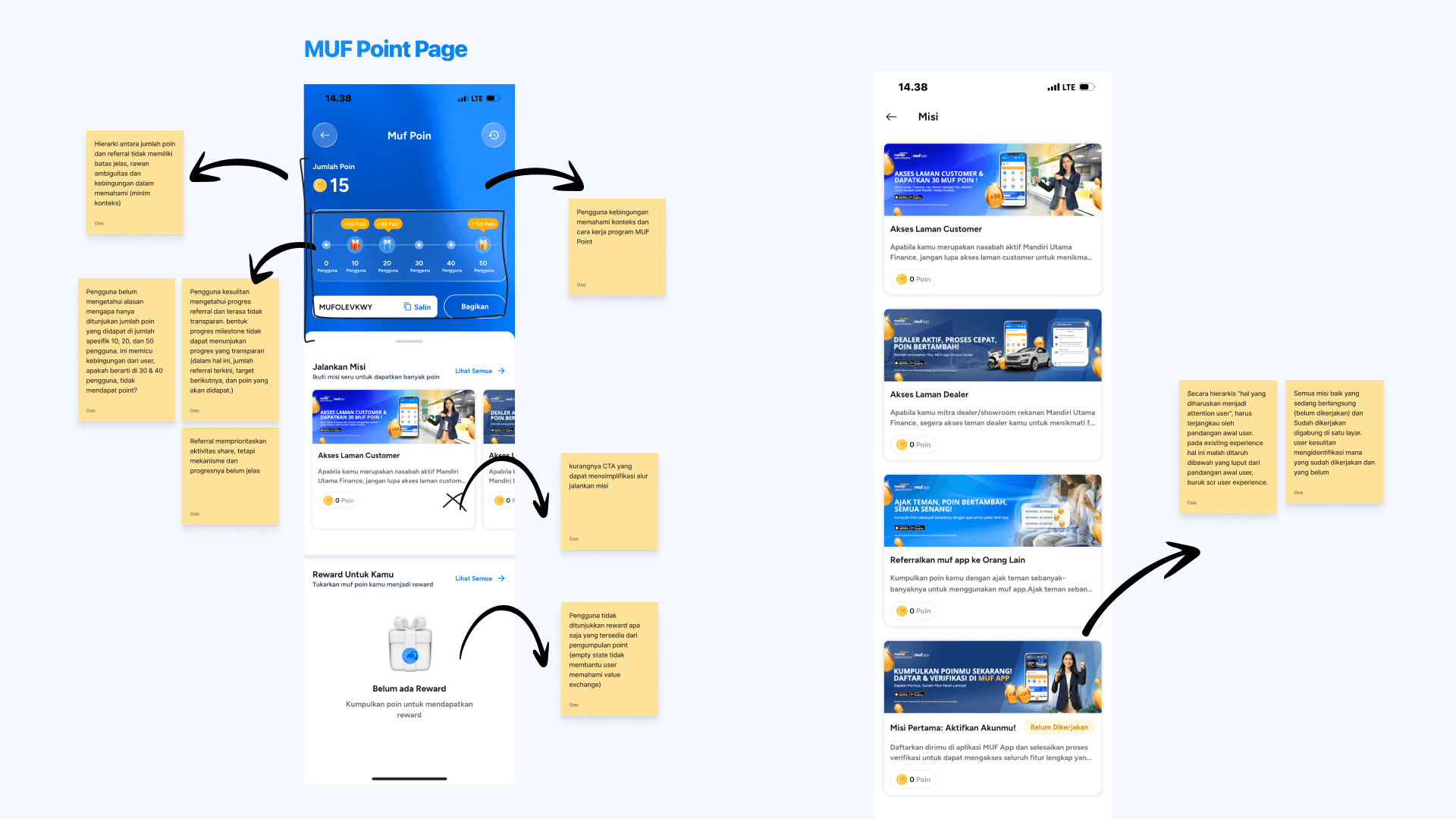
Users can see their point balance, missions, referrals, and rewards as separate features, but they do not clearly understand how the program works, which mission to complete, how many points they will earn, their referral progress, or which rewards they can redeem. As a result, the next action is unclear.
My Role
Solo UI/UX Designer, fully self-directed across the entire process, from product research and problem definition through flow design and high-fidelity UI, completed independently as part of the candidate assignment.
Process
Product Research & UX Audit: Explored the live muf app to understand the existing MUF Point structure, covering point balance, missions, referral, scoreboard, reward catalogue, and redemption flow.
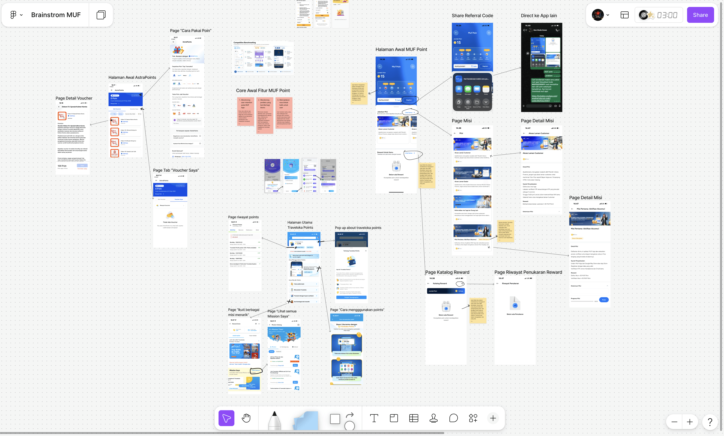
Competitor Benchmarking: Reviewed loyalty and reward features in comparable apps to identify common patterns for progress transparency, mission states, and reward clarity.
Problem Definition: Synthesized audit and benchmarking findings into a single, specific problem statement to keep the solution focused rather than solving everything at once.
Solution & Flow Design: Proposed a targeted solution and mapped it into a simple flowchart, adding decision points only where relevant to the new experience.
High-Fidelity UI Design: Translated the solution into key mobile screens, presented as before-and-after comparisons with annotated reasoning for each design decision.
Solution
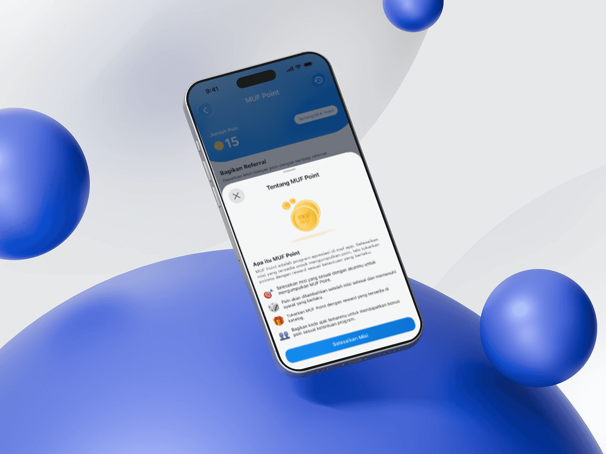
Added an "About MUF Point" entry to explain how users earn and redeem points, closing the informational gap identified in the audit.
Made referral progress transparent through levels, current referral count, next target, and upcoming bonus points, replacing the unclear milestone-based display.
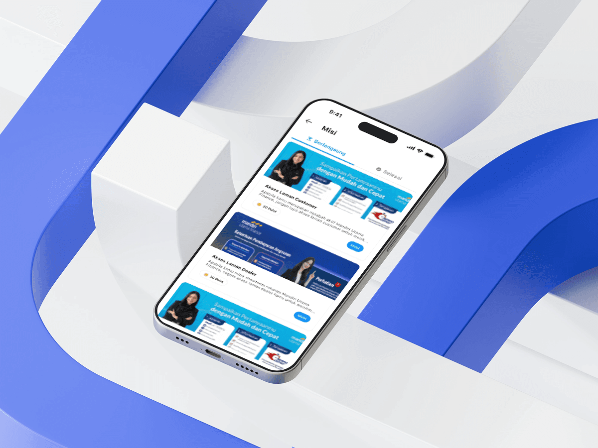
Reorganized missions into In Progress and Completed states with visible point rewards and a clear CTA, removing ambiguity about what to do next.
Displayed the reward catalogue with point requirements and a Redeem action, helping users understand the value of their points.
Delivered the full solution as a single Figma file containing problem and solution reasoning, flow process, and high-fidelity screens with an interactive prototype, matching the assessment's submission requirements.
Documentation